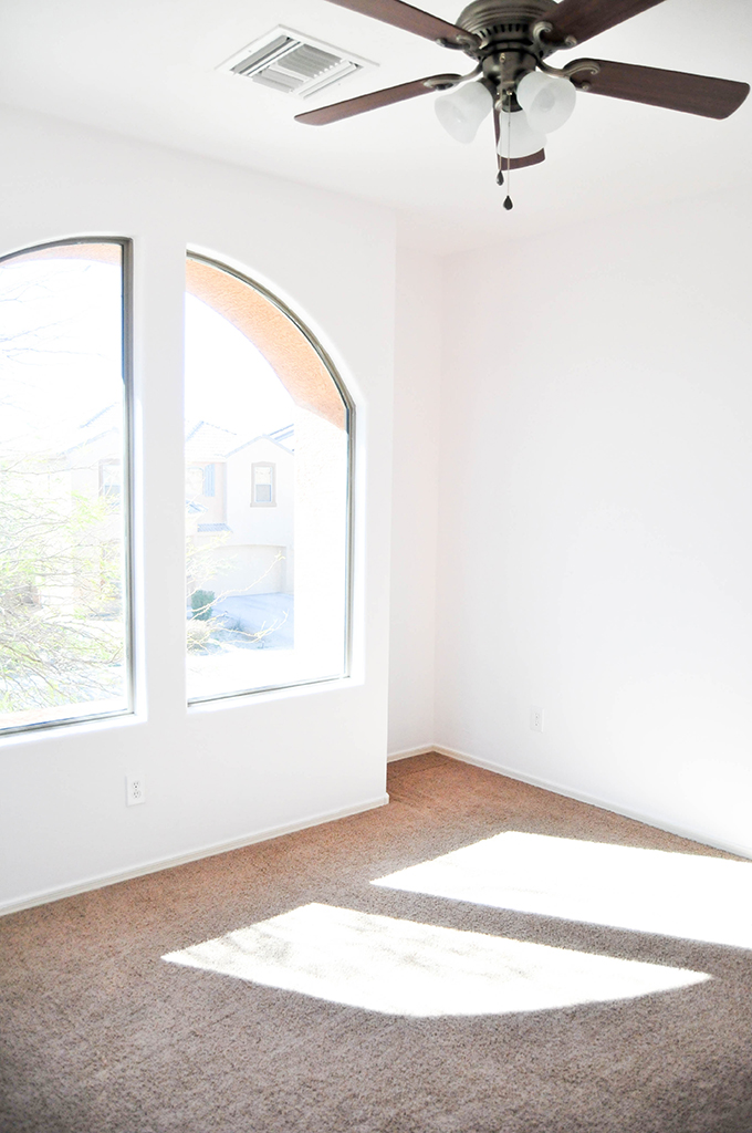
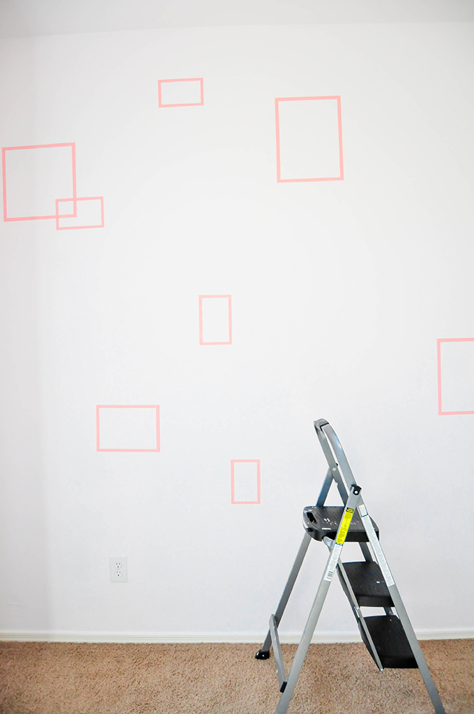
Okay, so here’s where we ended things in part 1 of our office & guest room makeover with Dutch Boy Paints:
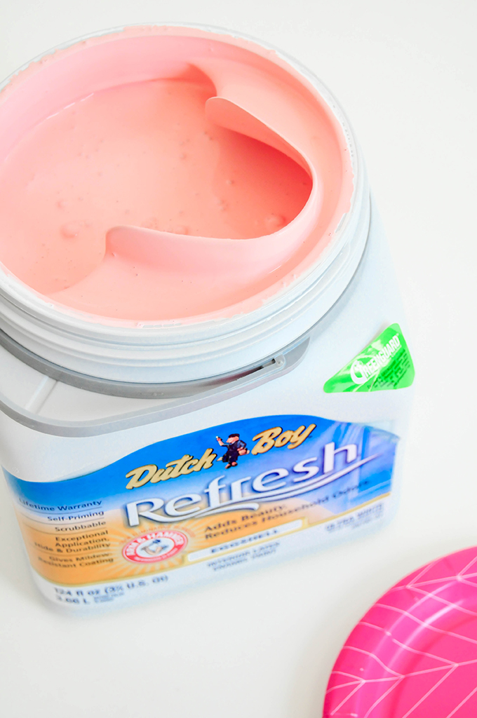
The room had been painted with a bright white (Dutch Boy® Refresh® Paint in Waimea White, DW44) and was ready for a little stencil action! Like I said earlier, I wanted this room to be able to transition into a room that matches Vita’s personality and the room décor she has now. We chose a stencil color called Faded Coral A9-3, by Dutch Boy, that can work with the adult décor we have in the room now, but doesn’t look childish or feminine.
After playing around with a few ideas, I decided on a simple graphic pattern involving square outlines with a few that overlap. See below!
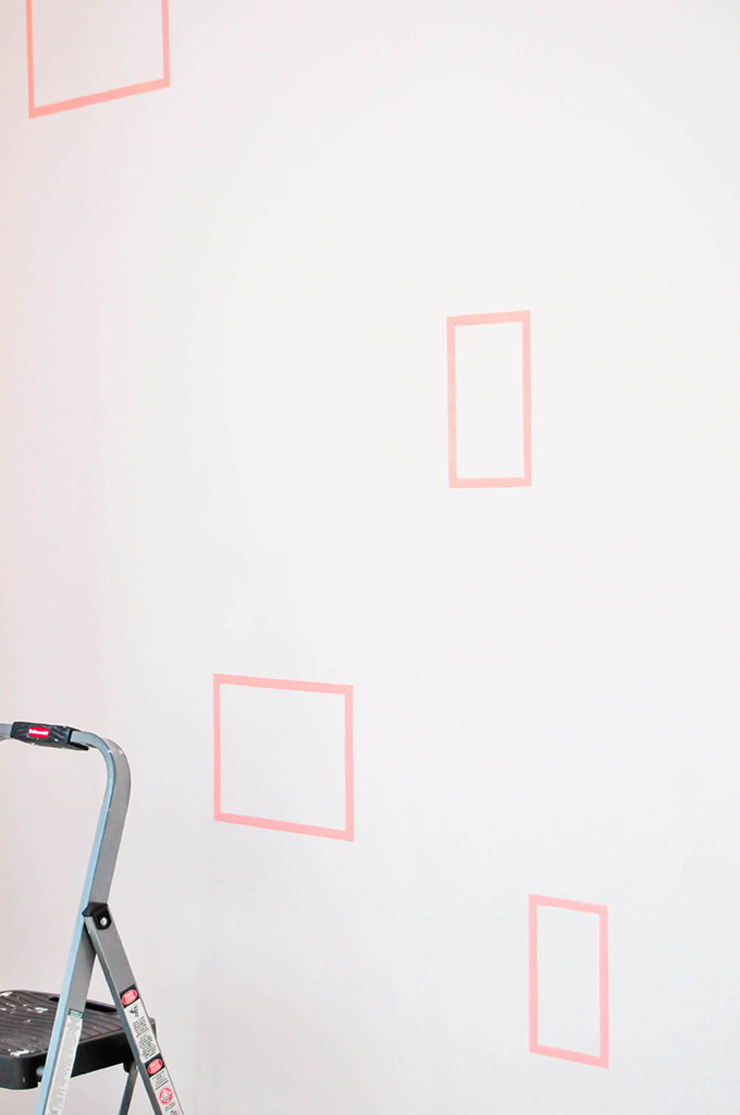
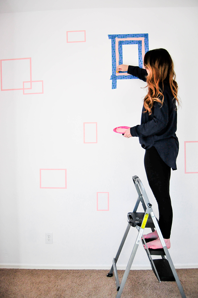
I cut out a bunch of squares in assorted sizes on adhesive-backed paper to use a stencils for the wall design. 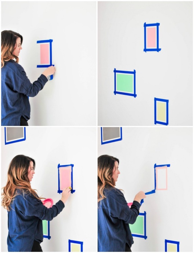
After attaching the squares to the wall, I outlined each square with blue painter’s tape and painted the negative space with Dutch Boy’s Faded Coral
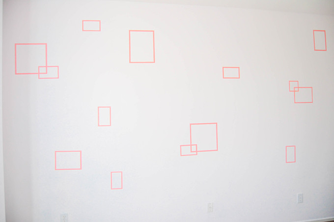
I wanted the wall to seem open and uncluttered, so chose to only overlap a few squares on the wall. And here’s what it looks like now:
CUH-ute! I couldn’t love how it turned it out more than I do. The overlapped squares look even better in person!
Once the paint was dry, we cleaned up the room and brought in some furniture! (Including a DIY bed that I’ll be sharing the how-to later this week!) Here comes the picture overload! Ready yourselves!
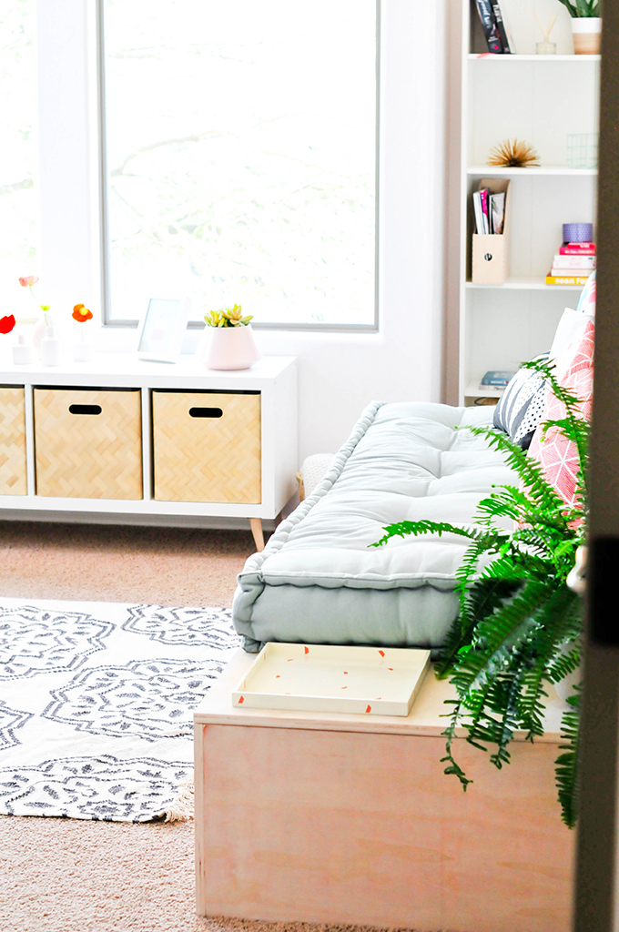
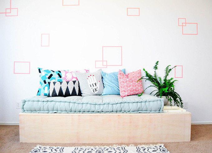
Voila! A room I actually want to walk into now!
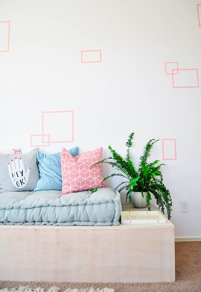
The cushion on the bed is 6 feet long, and we extended the bed about 15 more inches beyond that to act as a side table to place plants, books, and beverages on. We’ll be sharing the how-to for the bed later this week! I’m pretty excited about it because it has some secret storage compartments inside! A perfect storage solution for spare blankets, bedding, and odds & ends.
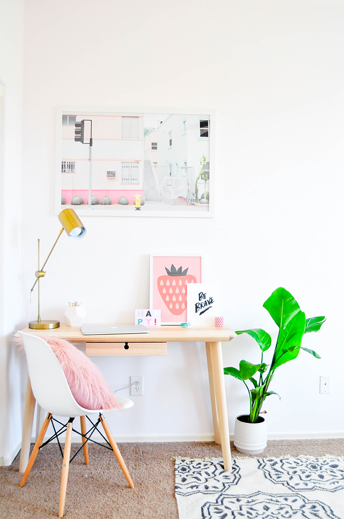
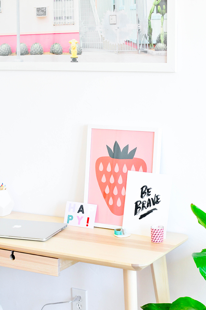
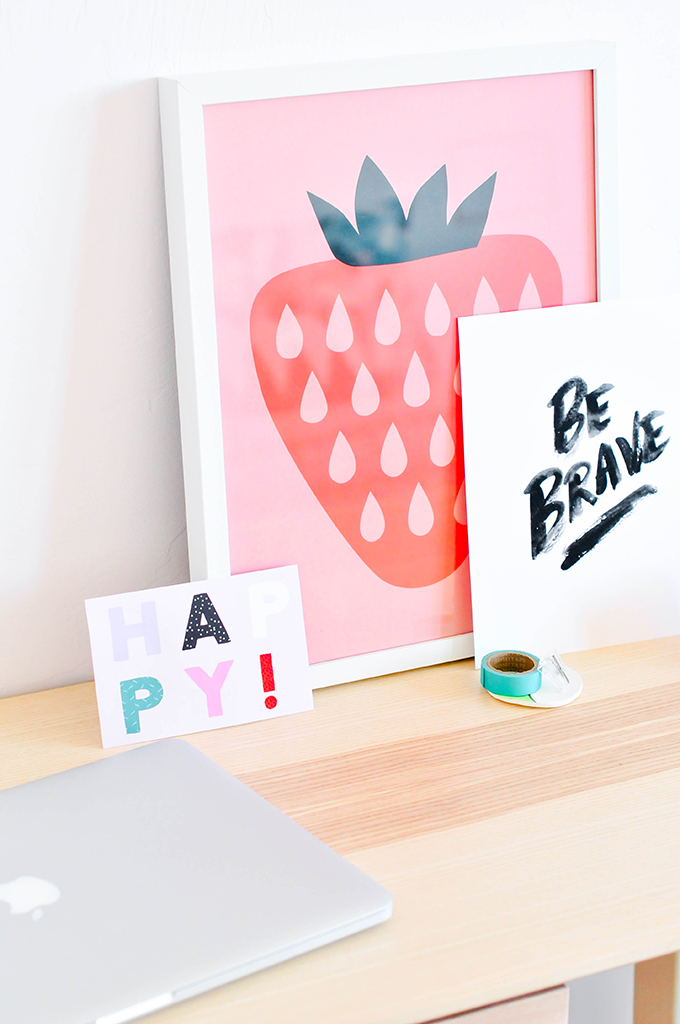
The guest room is also acting as a mini-office, so we equipped it with a simple desk and some colorful decor like that giant & gorgeous print by Reality & Retrospect!
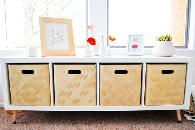
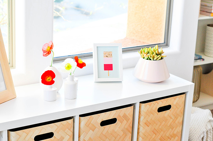
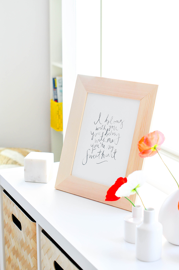
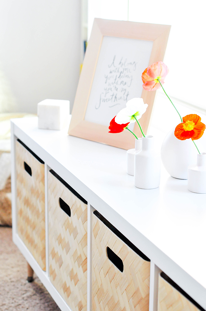
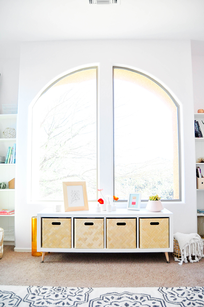 Angled table legs make this IKEA dresser feel a little more MCM and we filled the cubbies with wooden storage bins to hide any unorganized storage.
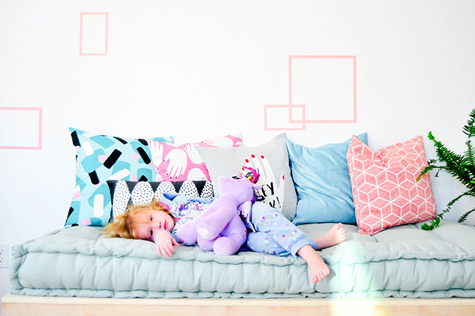
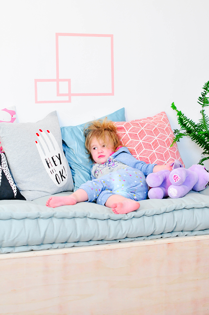
Vita woke up from her nap while we were shooting and insisted on laying on her new bed. She walked in, gasped, and said “ohhhhh! That looks like MY bed!”. That girl knows how to get her way. 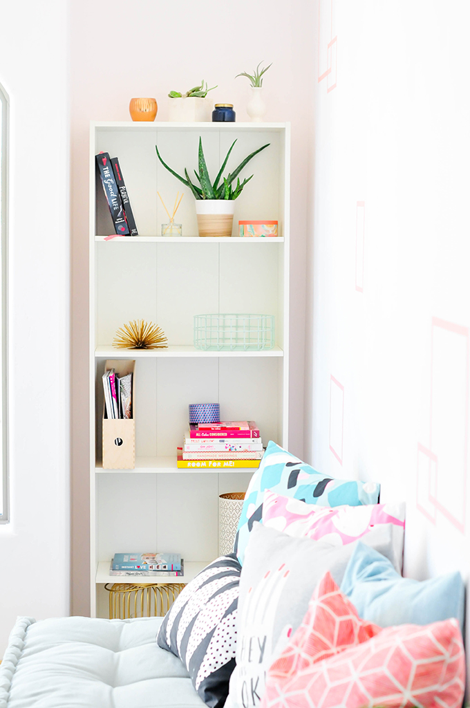
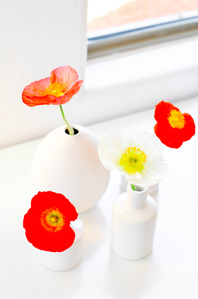
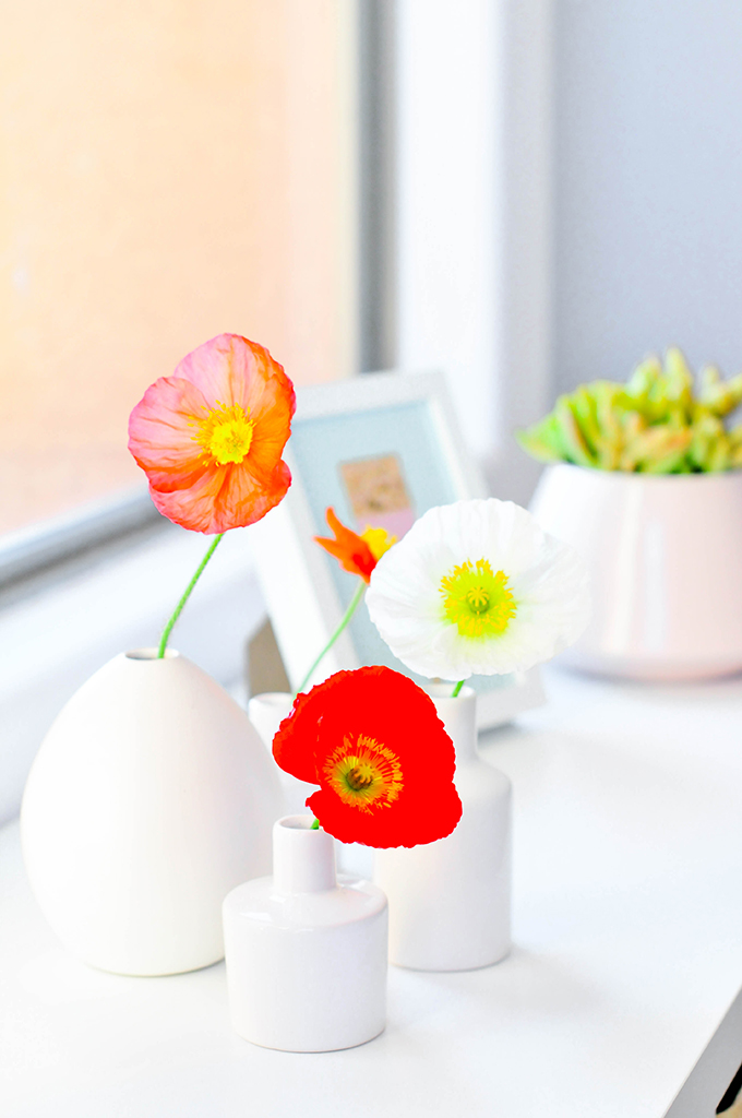
I believe flowers make every space better, so I snipped a few poppies from our garden and placed a handful of single-stems in an arrangement on top of the dresser. They just scream happiness!
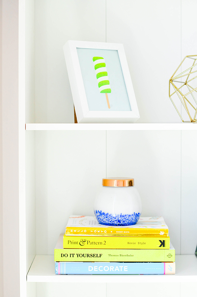
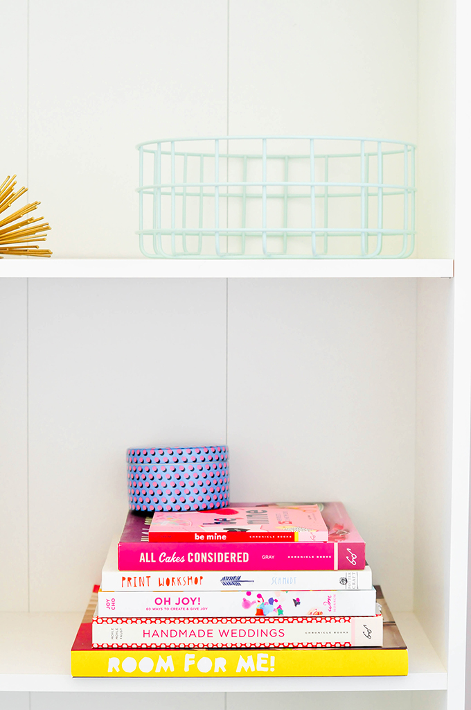
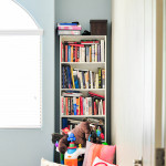
Color-coordinated books on the shelves for the win! 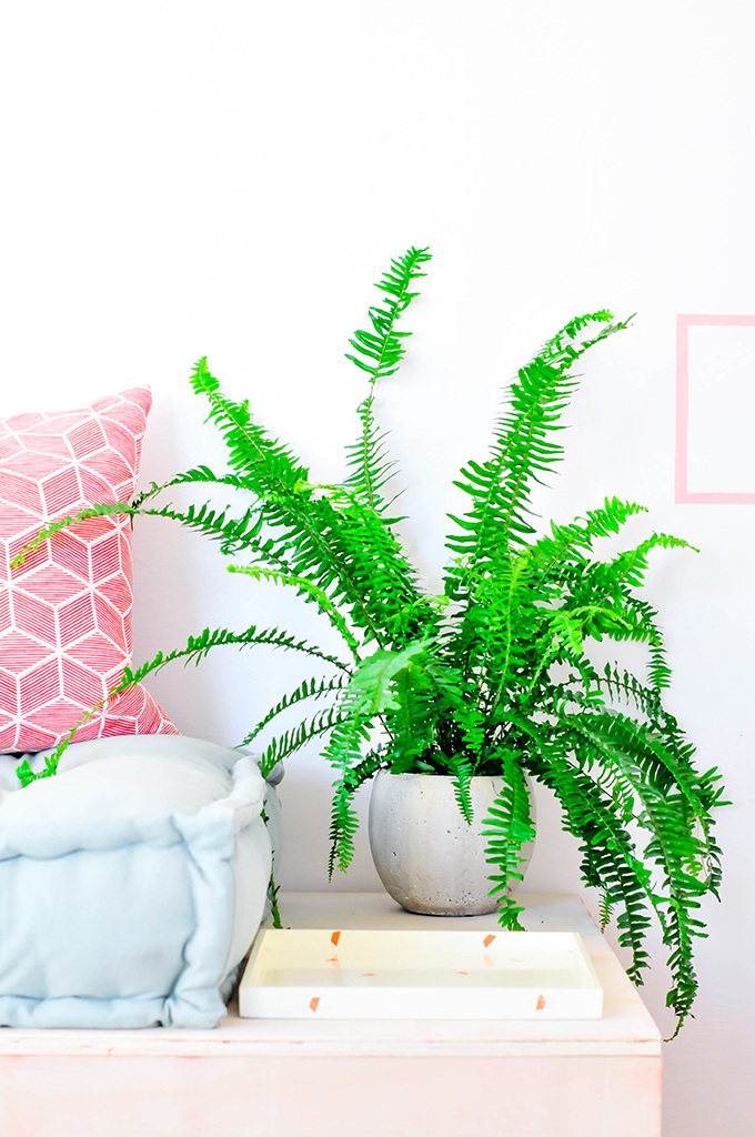
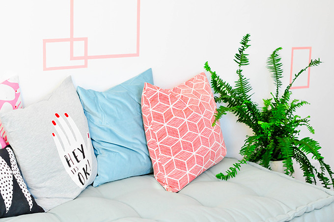
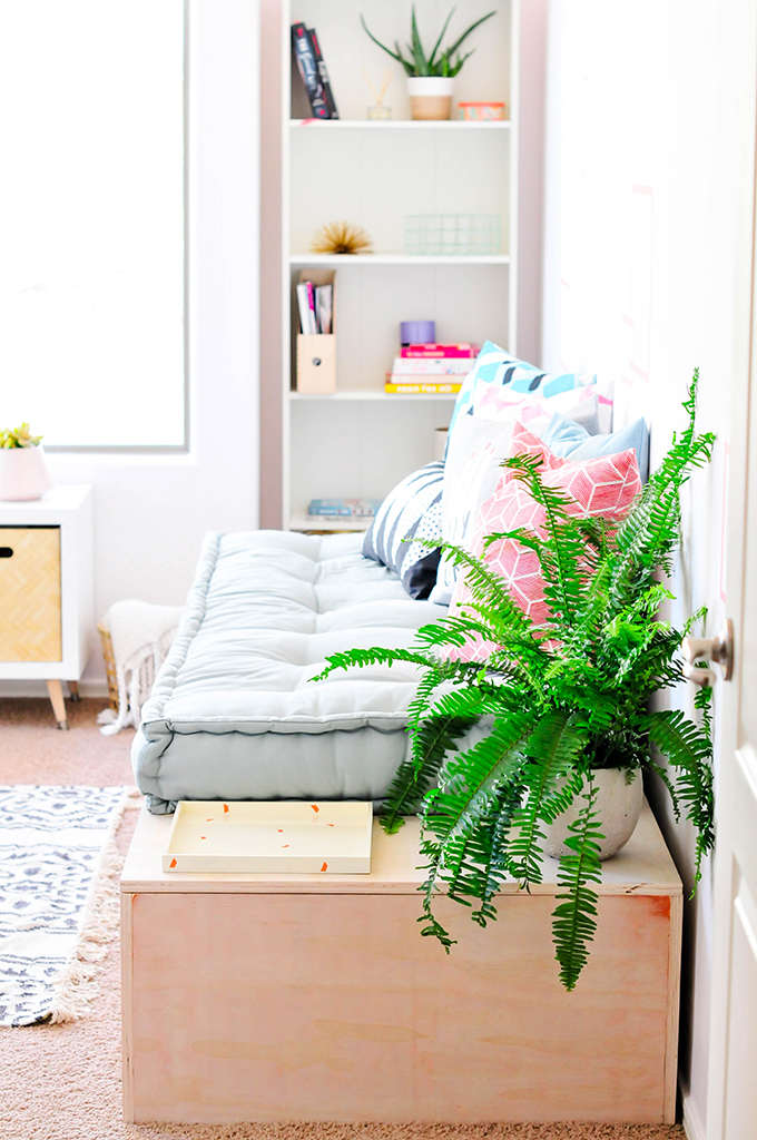
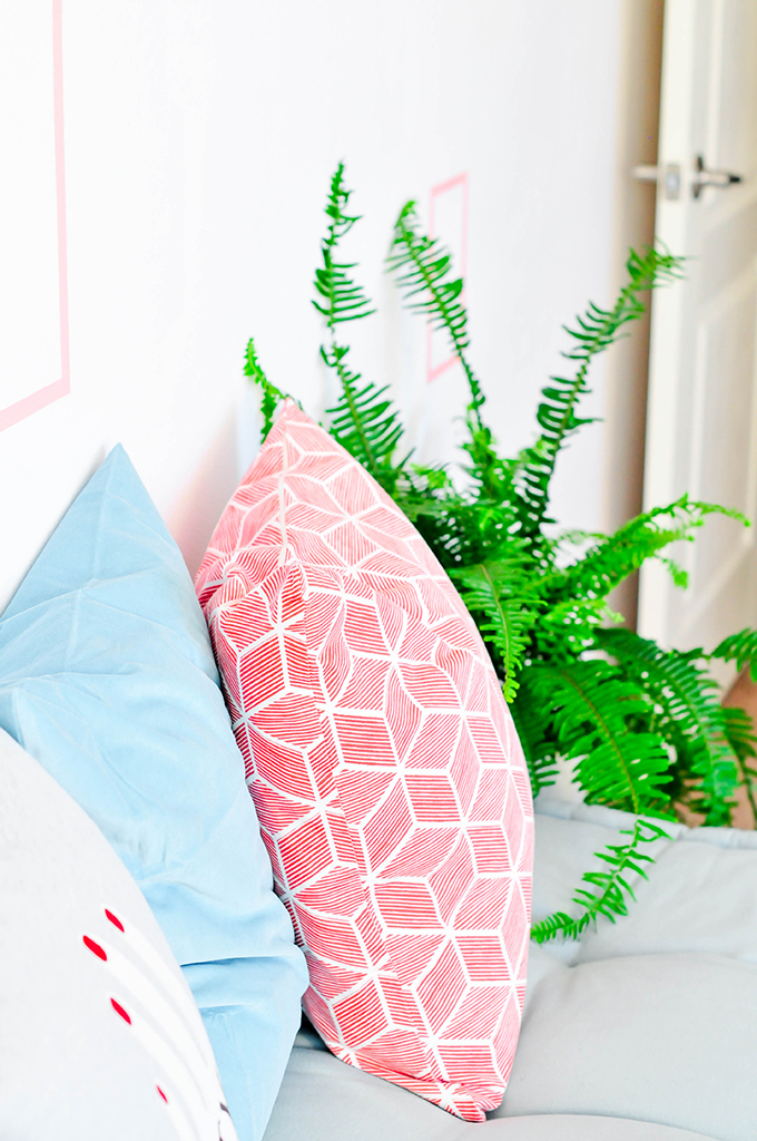
An assortment of pillows with a few geometric patterns tie in with the square stencil on the wall. 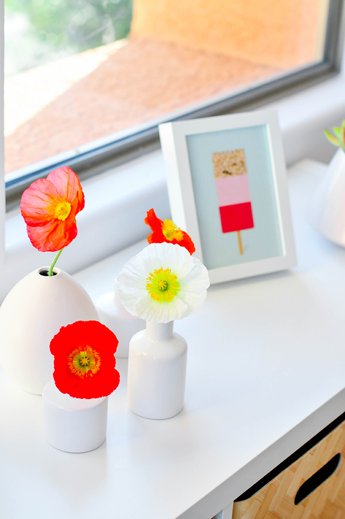
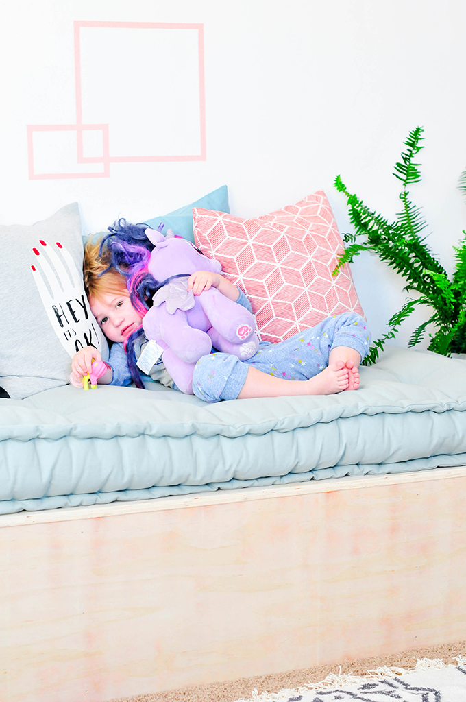
Sidenote: the ponies come with us everywhere. EVERYWHERE. 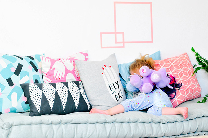
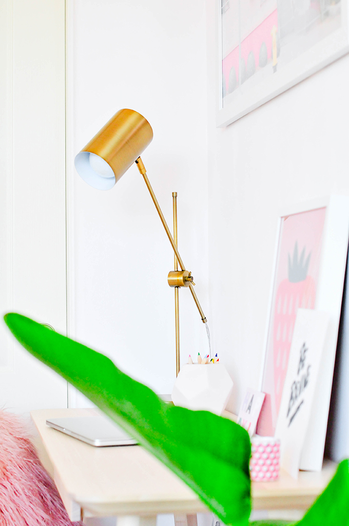
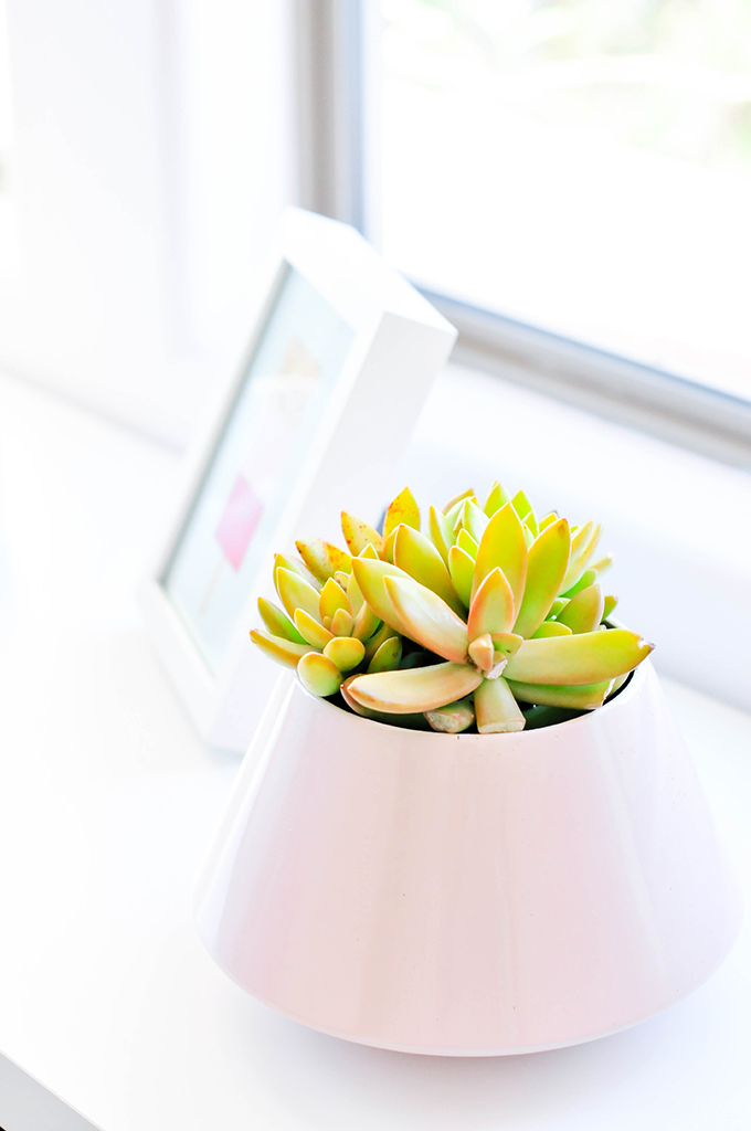
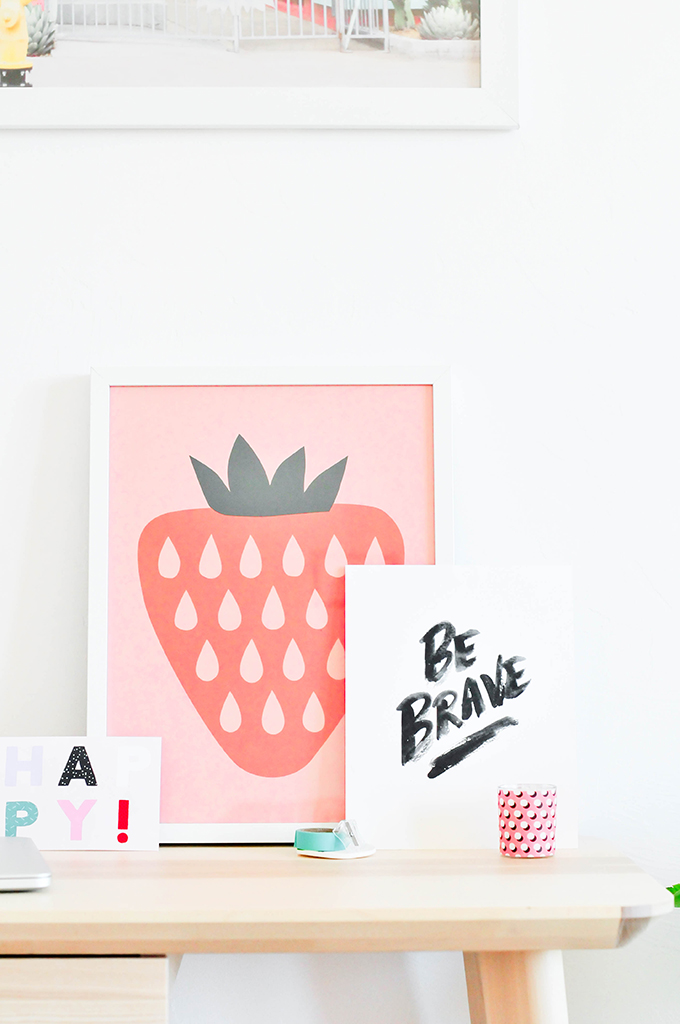
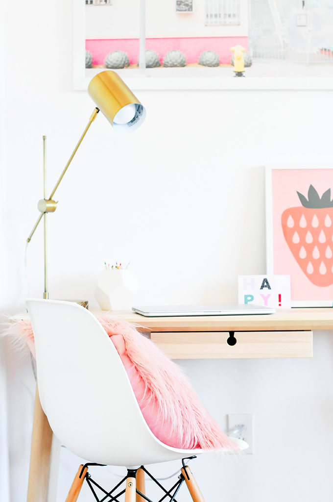
I’m going to have to fight those pals who stay with us for this cozy little workspace. 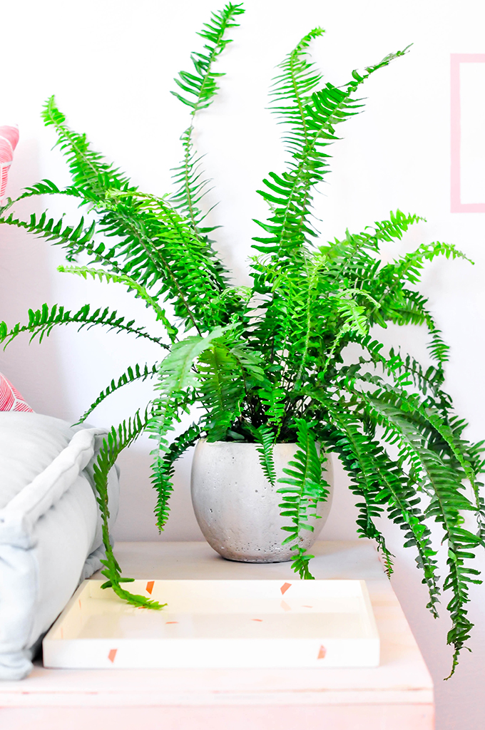
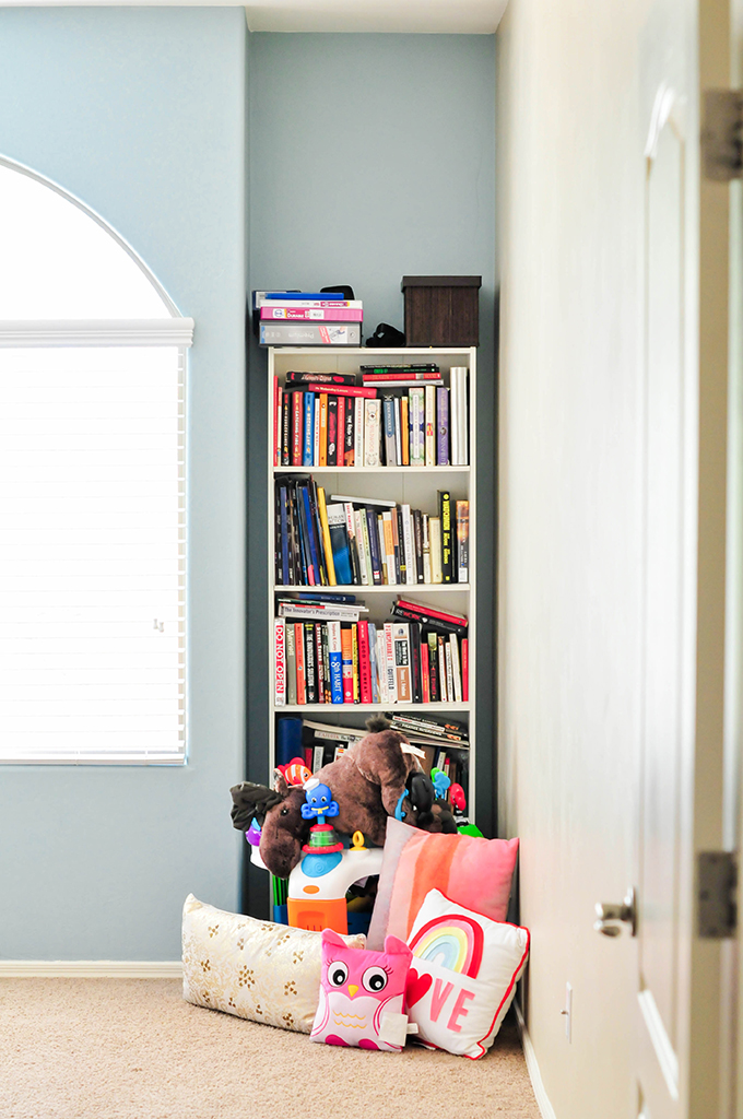
Look how far we’ve come! This is what the room used to look like when you walked in.
And the current view today!
A huge HUGE thank you to Dutch Boy Paint! We absolutely love this space and feel so proud that we did it all on our own. Dutch Boy Paint recently rebranded and has a new website with alllllll the fix-ins for a beautiful space! Take a tour around the site and play around with the color visualizer to see how different colors will look in your home!
I’m obsessed with this room and feel like I won’t need to bribe people with money to come and stay with us anymore. This room will do the trick! Now, who wants to come for a visit?! Be sure to check back this week to see just how we whipped up that snazzy new daybed!
**This post is in partnership with Dutch Boy Paint, a company that believes in quality paint for quality projects. Thank you for supporting the brands that keep Proper creating!
concept, design, & photography \\ Lexy Ward







This room is so bright and cheery! I love the Daybed and the bins in the dresser. Such a cute idea for a guest room!
Looks amazing, Lexy! What a makeover. Fab style. 🙂
Thanks, Amy! I’m a big fan of your taste so that’s such a compliment! 🙂
Such a gorgeous makeover Lexy! Absolutely smitten with the way you painted the wall. And that color!
Ohhhh, thanks, Rachel!!! I absolutely love the color, too! Cute and feminine without being over the top! 🙂
What a transformation! I love how this turned out. Can I ask where that rug is from?
EVERY single wall and surface is just gorgeous!!! I love how the room turned out!
GET OUT! I can’t believe this space, it is absolutely stunning! Every little detail! Your wall stencils are perfection, just the right amount of subtle and pink. Love love love. Also I’m pretty sure I’m making my own Kallax window bench now! xoxo
P.S. Your little one is too cute!
this looks gorgeous, lex!
What a beautiful space! Would you mind sharing the source for the wooden IKEA bins??
Thanks so much for the inspiration!
Erin x
What a great makeover! I really like the transformation.
Where is this desk from!
Hi Miki!!! It’s from IKEA! 🙂
Love the rug- where can I find it?!
Hey, Lexy! GORGEOUS room design- you’ve totally demolished my life=long disdain for square wall graphics. I just have to ask: where on Earth did you get that strawberry art print? My little girl’s nursery is loosely strawberry-themed, and that print would be a lovely addition.
Thanks!
Thanks, Samantha!!!!! The print is from IKEA! It comes in a pack of 3 with a pear and a lemon! It’s my favorite thing!
Your arrention to details, color and all the little MCM style points is fabulous. It’s hard to tell from the photo, but the only thing that IMO doesn’t fit is the wooden bed frame. It looks unfinished and too ” handmade” for this otherwise beautiful space.